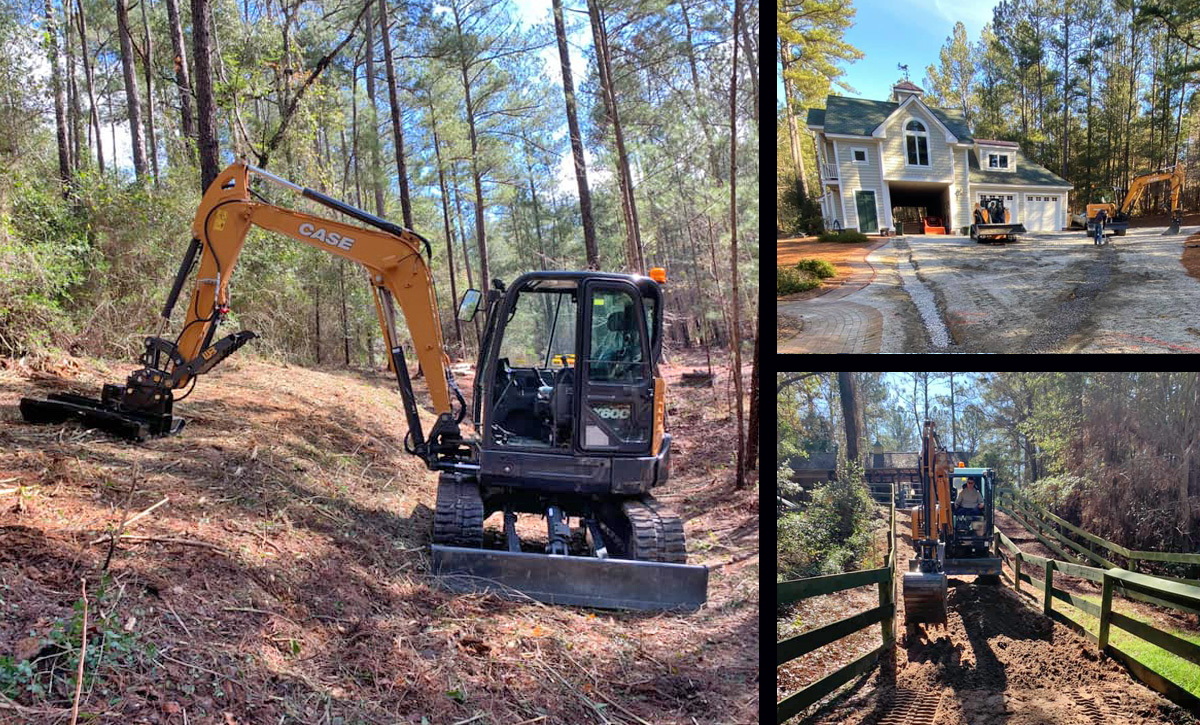
Southern Ridge Excavation

Clearing the way in the "CSRA"

Southern Ridge Excavation reached out to Bradford Ink as a local client who was expanding their 3rd generation family run business to serve the Aiken/Augusta GA region utilizing skidsteer and mini-excavator equipment.  This move, combined with the exploding construction market, necessitated a ground-up logo design to ensure Southern Ridge Excavation was poised to present itself as an established and polished outfit.

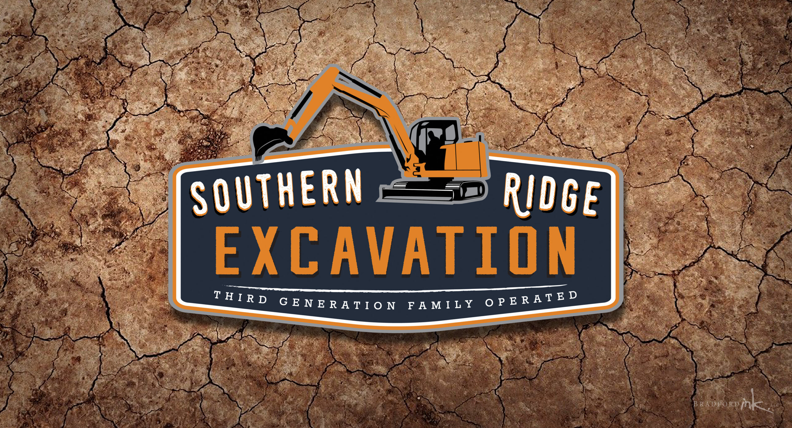
LOGO DESIGN

After speaking with the client about their aesthetic preferences, we decided to pursue a design that felt strongly industrial, and paid homage to old-school signage with simplicity and thick lettering.  It was agreed that we had to integrate a full excavator illustration into the design, and we were able to smoothly fit it in between the title text.  The colors are classic and unpretentious, and the overall shape will fit handily on truck doors or chest embroidery alike.

CLIENT

Southern Ridge Excavation

MISSION

New logo design for a family owned company

HATS WORN

Designer and Mini Excavator connoisseur
SRE work