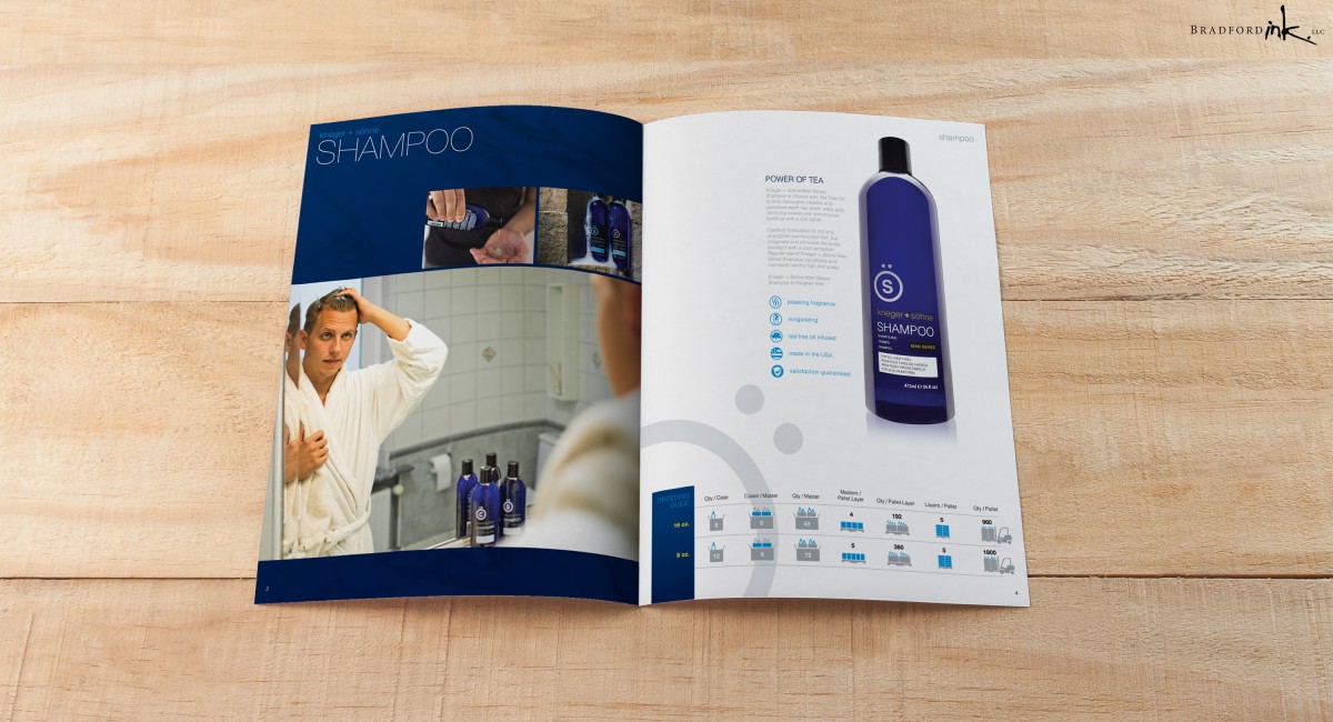
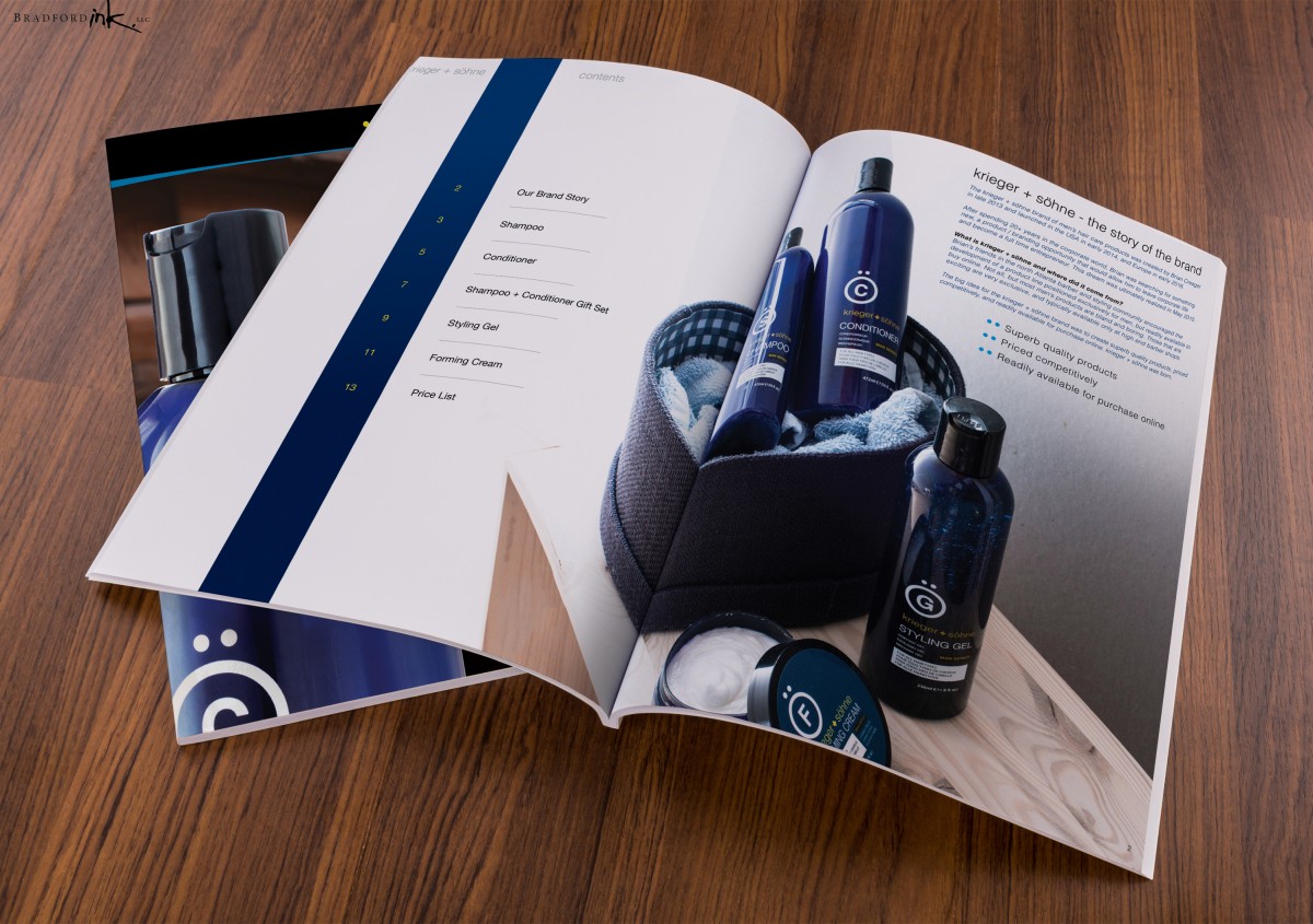
krieger + söhne approached Bradford Ink looking for a versatile catalog solution for their expanding 2016 product line. Working from a few past design projects gave a bit of a jump start into a design feature that looks simple on the surface but a deeper look reveals some interesting takes on funneling a broad swath of numbers into a legible reference piece.
First order of business involved developing a reading experience that matched the overall tone and atmosphere of the K+S product line while maintaining functionality whether the material was printed bound or simply as a one-page tear sheet. Once we identified a viable footprint to present the artwork, Bradford Ink worked to condense a variety of information into bite-size icon series and engaging copy that complimented and balanced their vibrant photography.
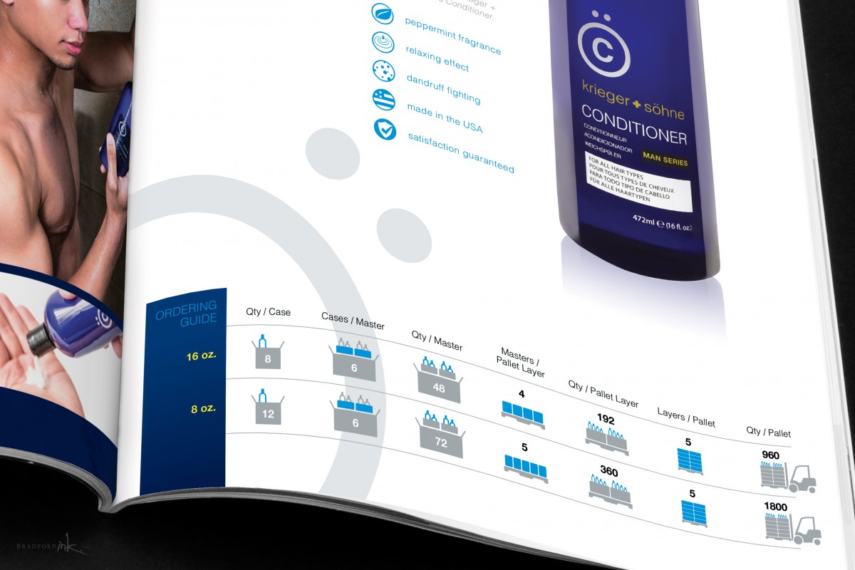
Finally, we also had to address the core functionality of the product metrics through creation of an “Ordering Guide” at the bottom of each page. A distinct icon language was developed to show the quantities of product across various shipping forms increasing in size. This Guide works through both visual markers and intuition to help Wholesalers reference necessary metrics at a quick glance while also being aesthetically pleasing and brand relevant.


