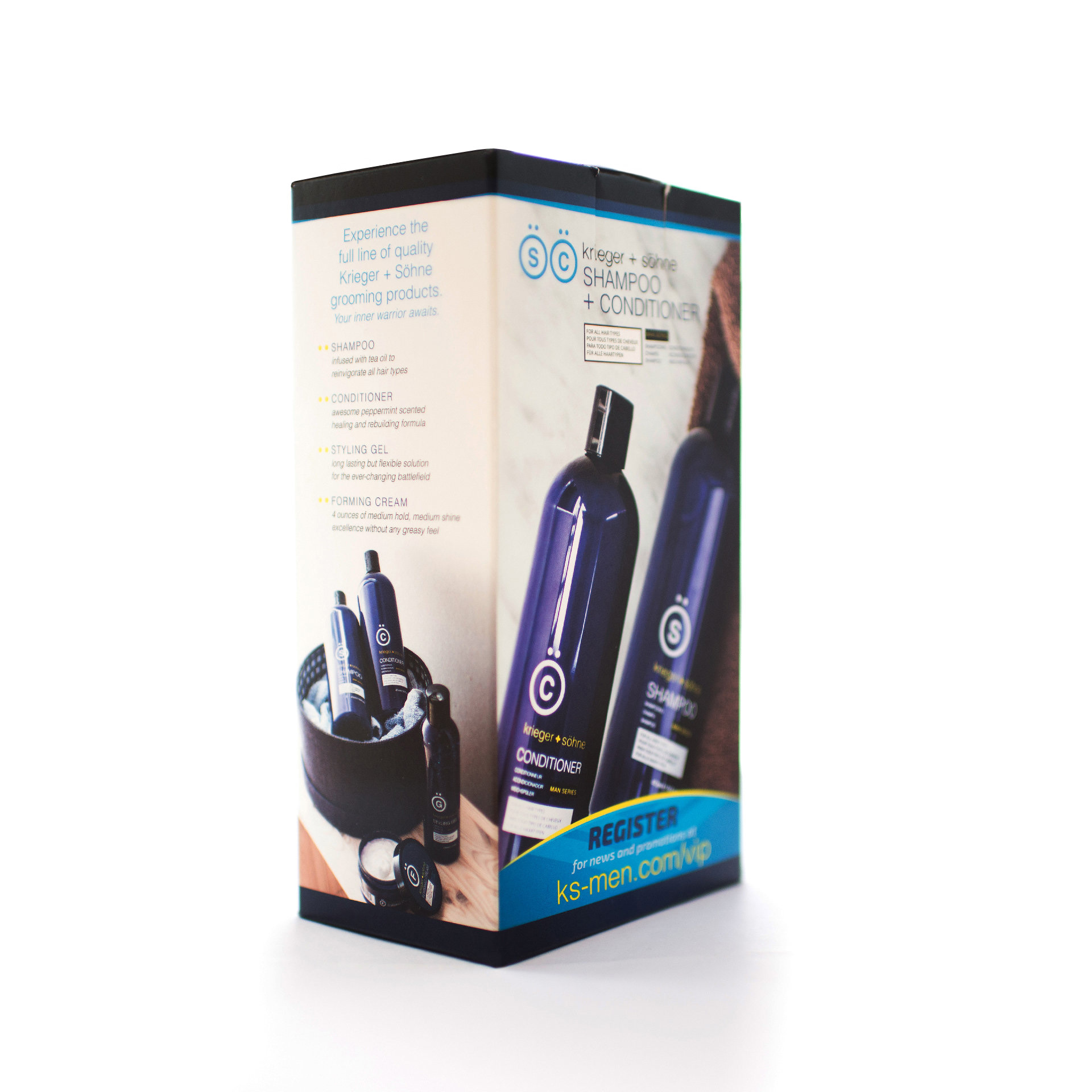
krieger + söhne has a history of various graphic projects with Bradford Ink in the packaging and collateral realms. Having this foundation already established made it critical that this new artwork felt contiguous with the existing brand identity.
Starting from a bare die line, this new Man Series Shampoo artwork came together on a fast track to supply a new sales opportunity with an expansive retail audience. Beautiful photographic composition combined with careful content placement helps this attractive packaging draw customers in, while retaining an honest functionality and informative element.
The result is a nuanced execution that lets the attractive product do the talking while at the same time framing it within a familiar top-shelf sleekness that permeates the overall branding.

