Deer Clear

Taking control of deer induced property damage

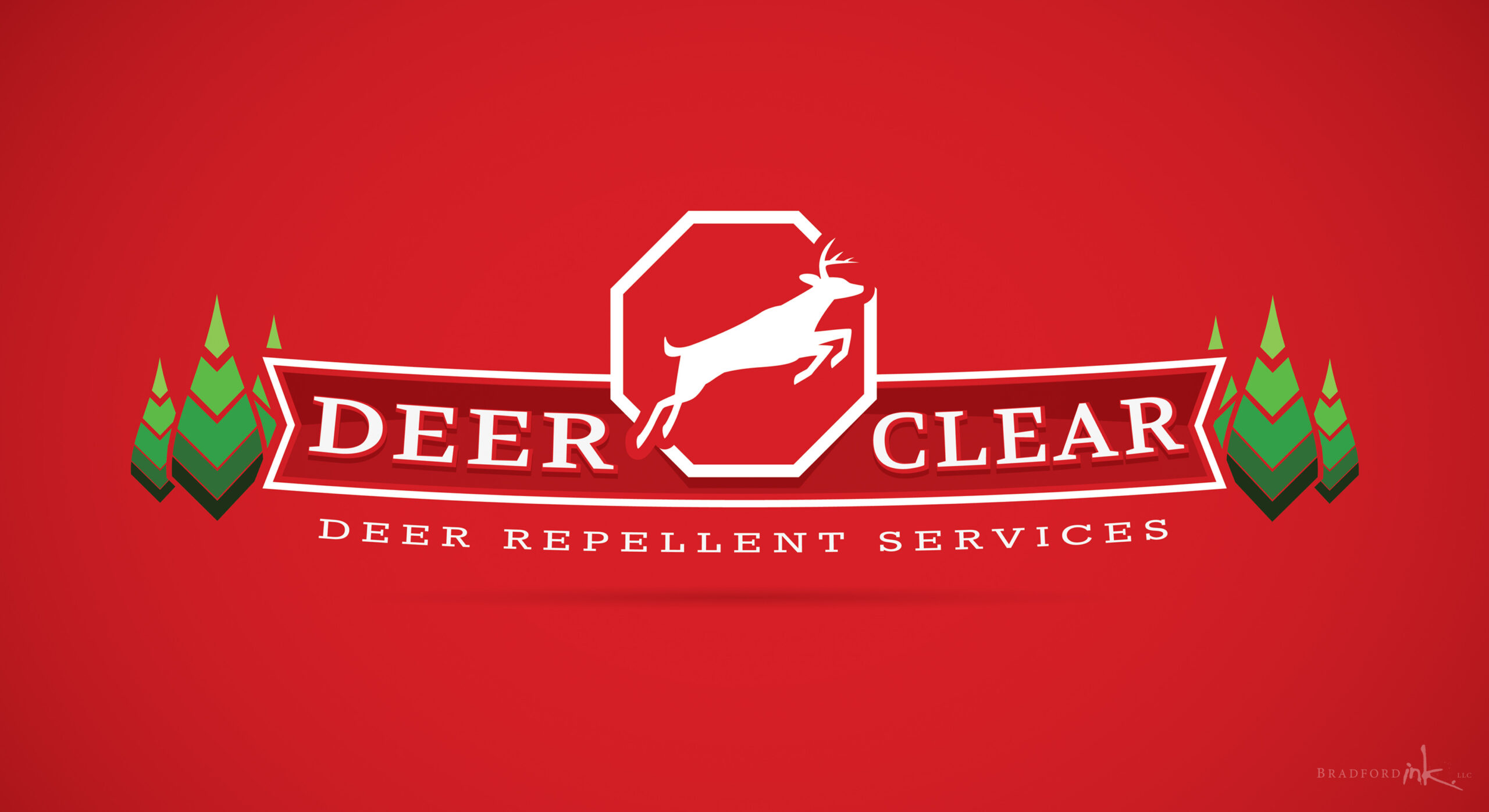
Beautiful in nature, deer can be incredibly destructive when their population causes them to encroach upon developed regions, both in their appetite for ornamental plants and vegetables as well as their capacity for spreading Lyme Disease.  Deer Clear sought out Bradford Ink to create a vibrant logo that would help them gain visibility in the Jersey area for their deer repellent service.  Broad and full of high contrast linework and color, the logo design communicates the business intent unmistakably.

LOGO DESIGN

Building on some graphic elements from the client’s other related businesses, the goal of the logo was to be super clear in its message as well as having a polished, professional aesthetic that elevated it beyond the typical trapper or repellent spreader business.  The wide, low stance brought in a sense of horizon and the bold lettering within the banner is neither trendy or overly decorative – just straight to the point.  The leaping deer was the perfect way to cap the design off, front and center within the “stop sign” element.  This broad design is ideal for service vehicles, especially vans.

MAILER

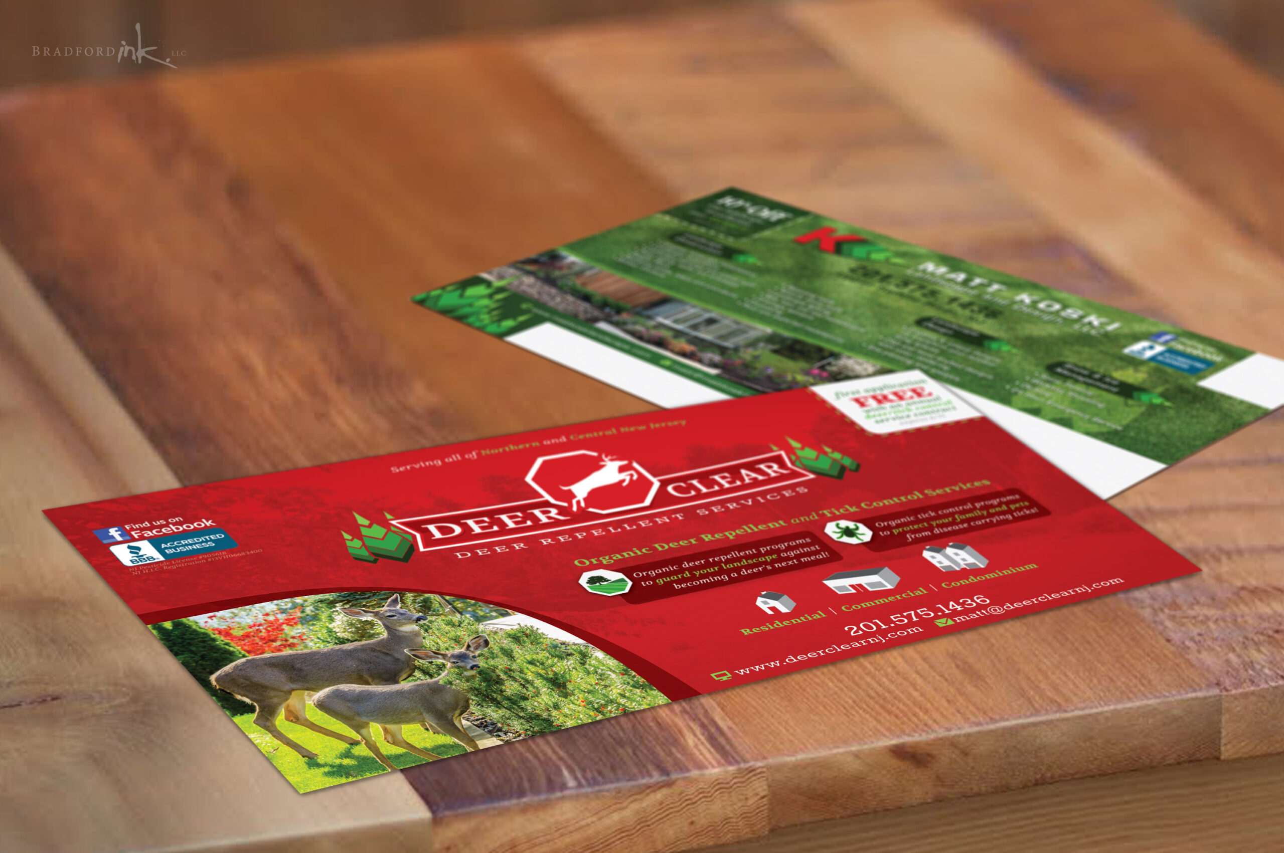
Deer Clear needed a 12×6, large format mailer to grab some attention in their service region.  Bradford Ink came up with a 2 sided combo mailer featuring both the Deer Clear brand as well as the client’s other business, Matt Koski Landscape and Design.  Each side was created with bold icons, simple calls to action and plenty of color and contrast to reinforce the important product messages quickly and intuitively.  Bradford Ink handled all mailing route logistics for the client after confirming route resident data and postal budget.

CLIENT

Deer Clear

MISSION

New logo and supporting large format postcard mailer

HATS WORN

Designer, Postal Route Surveyor, Deer Photo Connoisseur