Coleman Huntoon & Brown

Helping an established agency move forward with a new look

Coleman Huntoon & Brown PLLC came to Bradford Ink with a total rebranding proprosal. This agency has enjoyed a long heritage of exceptional service and integrity in the Chapel Hill, NC area, but felt their logo and associated identity no longer matched up well with their efforts to stand apart in an increasingly competitive market place.

Bradford Ink worked closely with both the Administrative Team and the Partners to assess the most effective solution and quickly developed a modern design that felt grounded, but distinctive.

LOGO FEATURES

The main foundation of Coleman Huntoon & Brown’s new identity would revolve around a succinct and uncluttered new logo aesthetic that could effectively convey the overtones of experience and prestige while still striking new clients with a sense of relevancy and accessibility.

We first established a dynamic design based on a classic bar graph progression with some perspective to provide depth, movement, and stability.  This figure implies growth and sustainability, and felt like a natural extension of the firm’s primary capabilities.  A healthy injection of bright, high contrast color – purple adds a regal touch and green for growth, speed, and freshness – brought a normally mundane financial figure to life.

Fonts provide a sense character to a critical aspect of the logo – the company name.  An honest, simple font was chosen that is both lightweight and assertive to properly balance out the heft of the graphic on the left side.

PRINT MARKETING MATERIALS

Bradford Ink worked on a suite of print items for immediate deployment with the new logo mark:

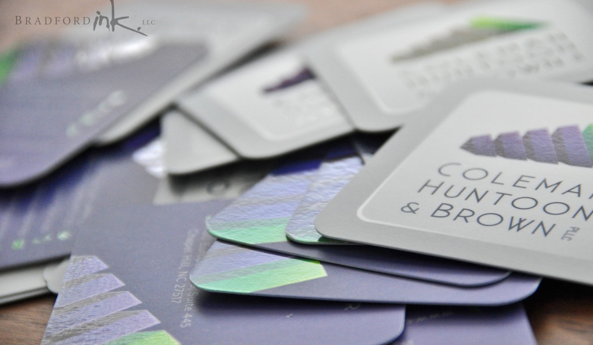
  • business cards
  • letterhead
  • shipping labels
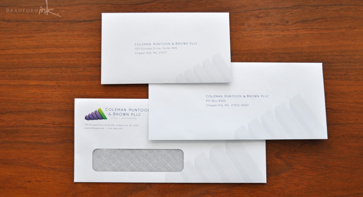
  • #10 custom window envelopes
  • #9 custom envelopes
  • #6 custom envelopes

We chose a square business cards for not only the unique and eye catching nature, but how it managed to be an excellent fit for the proportions of the logo for a classy presentation.  The letterhead, labels, and envelopes both utilize a clean integration of the logo and subdued background graphics to blend function with appearance, and well-defined areas of color to help lend a powerful accent where appropriate.

INTERACTIVE WORKSHEET

Coleman Huntoon & Brown utilizes a valuable, multi-page fill-in sheet for their client’s convenience every year during tax season.  With the new branding, we had to develop a fresh new worksheet that combined a very high degree of legibility and practicality with new aesthetic.  The result is a well organized fill-in PDF document that turns the design elements of the brand into tools used to help define regions of information as well as direct the user’s eye to important functions.

CLIENT

Coleman Huntoon & Brown PLLC

MISSION

Ground-up agency branding and collateral development

HATS WORN

Designer, PDF Form Architect
CHB-Product-Spread-tilted
CHB-pille-of-cards
CHB-Envelope-suite