Church of the Holy Family

Bringing a family together

Holy Family Product Spread

Church of The Holy Family has enjoyed solid growth for years now, and found themselves in a position to enact a Capital Campaign that would allow them to renovate and refresh a large portion of the church structure in order to better accommodate a bigger group.  This initiative also allowed the church to be more effective in their stance to help to bring people together in an appealing mutual worship space.

Meetings and brainstorm sessions led to a clear vision of how the church was literally pouring their souls into the very foundation of this important new building project.  This conviction helped determine the direction of the logo, and in turn the aesthetic of the entire design suite, which included a pocket folder, brochure, fact sheet, postcard and powerpoint presentation.

Ultimately, the strong campaign package played a part in helping the church to obtain more funding than anticipated, and move forward with plans to develop the property so that the church can carry out its mission and fellowship with more purpose and clarity than ever before.

LOGO FEATURES

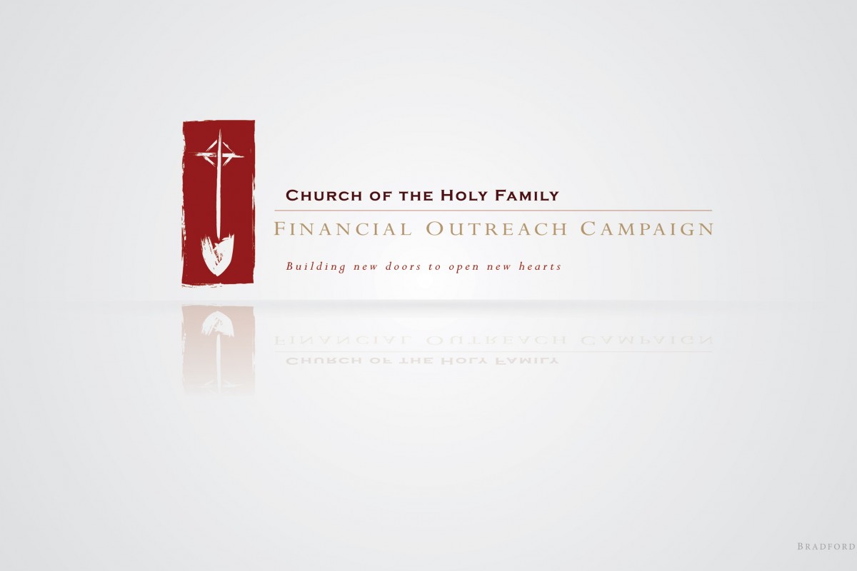
Meetings and brainstorm sessions led to a clear vision of how the church was literally pouring their souls into the very foundation of this important new building project.  This conviction helped determine the direction of the logo towards the theme of digging down…not just into the earth, but into essence of the church’s beliefs to provide for and welcome others.  The strong, heavy swath of traditional red is broken only by the rustic, weathered form of a shovel with the Episcopalian cross at the top of the handle.  Care was taken to ensure the shovel had a natural brush stroke applied to its form, and as it turned out, from a distance the shovel blade also bears resemblance to a heart shape.

CAPITAL CAMPAIGN ASSETS

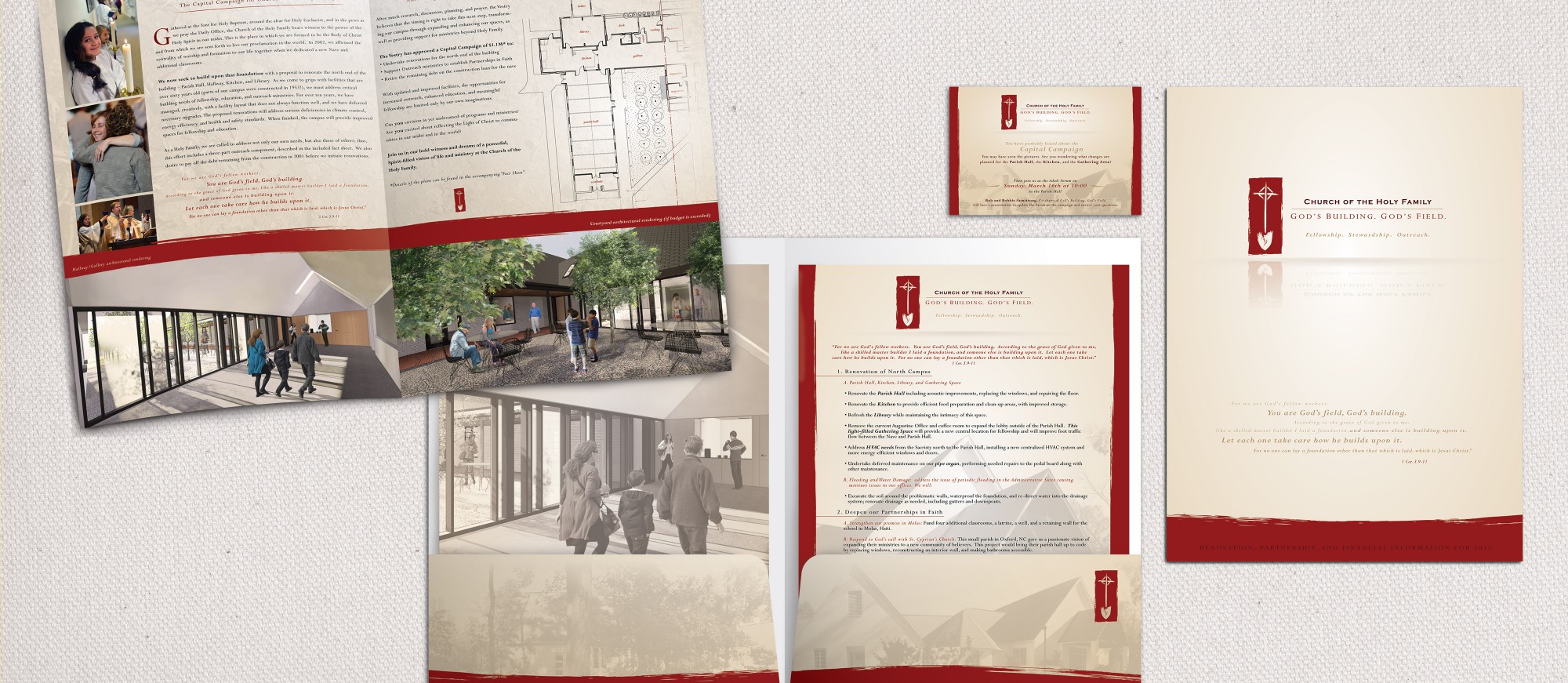
Holy Family’s campaign suite included a wide array of materials aimed at helping donors understand the criteria and scope of the construction and expansion at all levels.  Elements of this package included:

  • 9 x 12 pocket folder
  • 8.5 x 11 half-fold brochure
  • 8.5 x 11 fact sheet
  • 4 x 6 postcard
  • custom title slide and background file for Powerpoint presentation

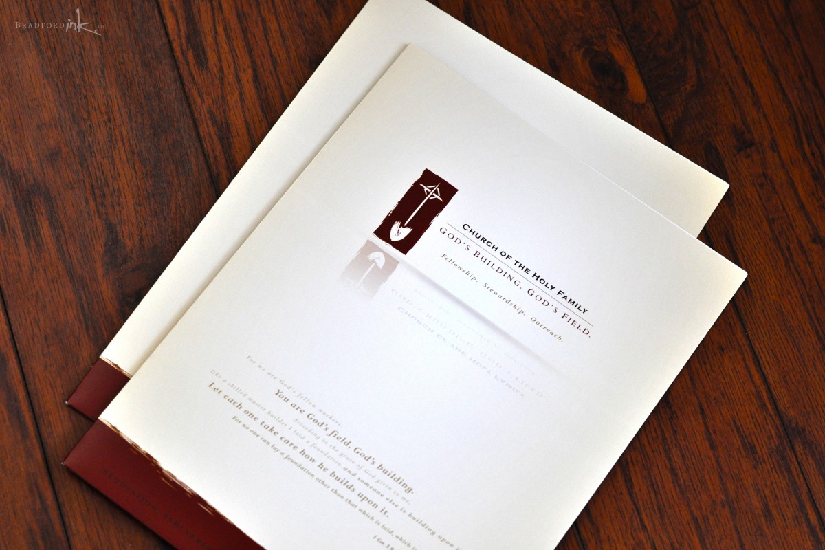
The pocket folder was designed to be a simple vessel for the detailed information inside, so a simple logo, applicable bible verse, and faded vistas of the property are the only design elements and don’t vie for attention.  Inside, the majority of the key info is found in a large half-fold brochure, which outlines the mission statement, concept renderings, and proposed architectural plans while also providing a platform to allow the large, bright imagery to captivate readers.  Additional support is provided by a single-sided fact sheet that attends to common questions and figures.

The last ingredient is a small 4×6 postcard that was sent out to the church’s congregation to raise awareness of an open forum meeting in which everyone would be welcome to ask questions and offer feedback.

ADDITIONAL ITEMS

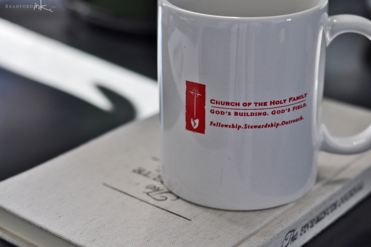
Can’t forget a cool little single-color coffee mug for the morning fuel-up.

CLIENT

Church of The Holy Family, Chapel Hill

MISSION

Build out branding and collateral for Financial Outreach Campaign

HATS WORN

Designer, Photographer, Parisioner
DSC_1102
DSC_1111
Holy Family Campaign Logo