Complete Chiropractic

Just what the doctor ordered

CC-logo

Complete Chiropractic opened a new office space in the heart of the bustling Southpoint shopping center in Durham, NC, in 2012.  Their fresh approach to Chiropractic medicine through modern, scientifically robust interpretations of established, effective techniques (aimed particularly at athletes and active lifestyles) made them a perfect fit for a location surrounded by NCAA Division-1 schools and communities.  However, the Chiropractic industry is littered with a surprising amount of very similar, contrived brand identities that simply fail to elevate one office above another.  Our challenge was to build a strong, modern brand identity that would help Complete Chiropractic stand out and stand apart – in a good way!

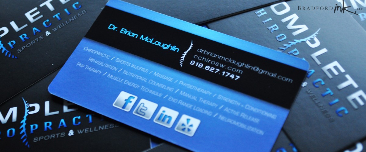
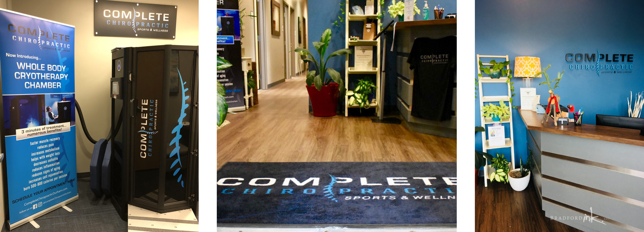
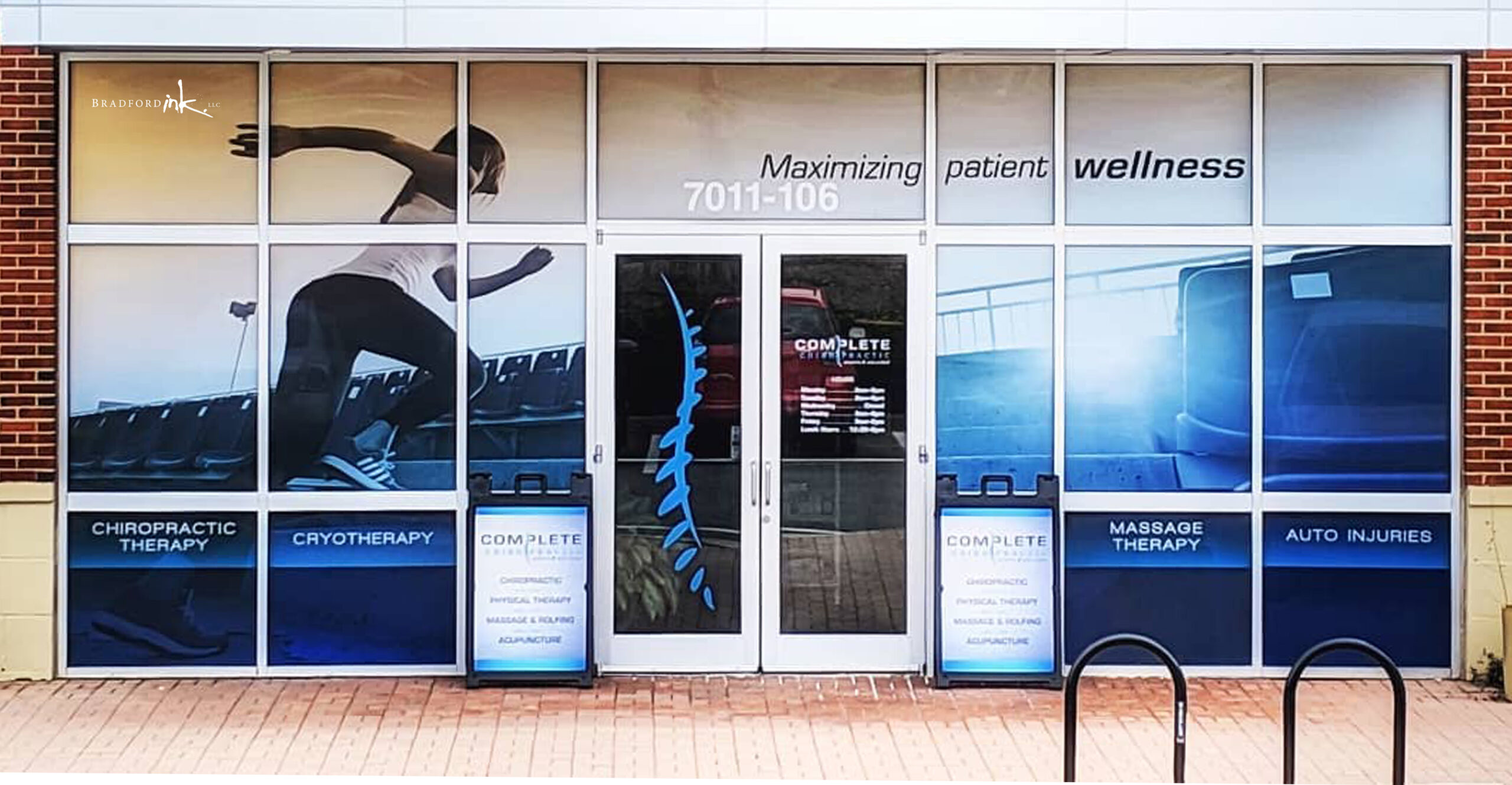
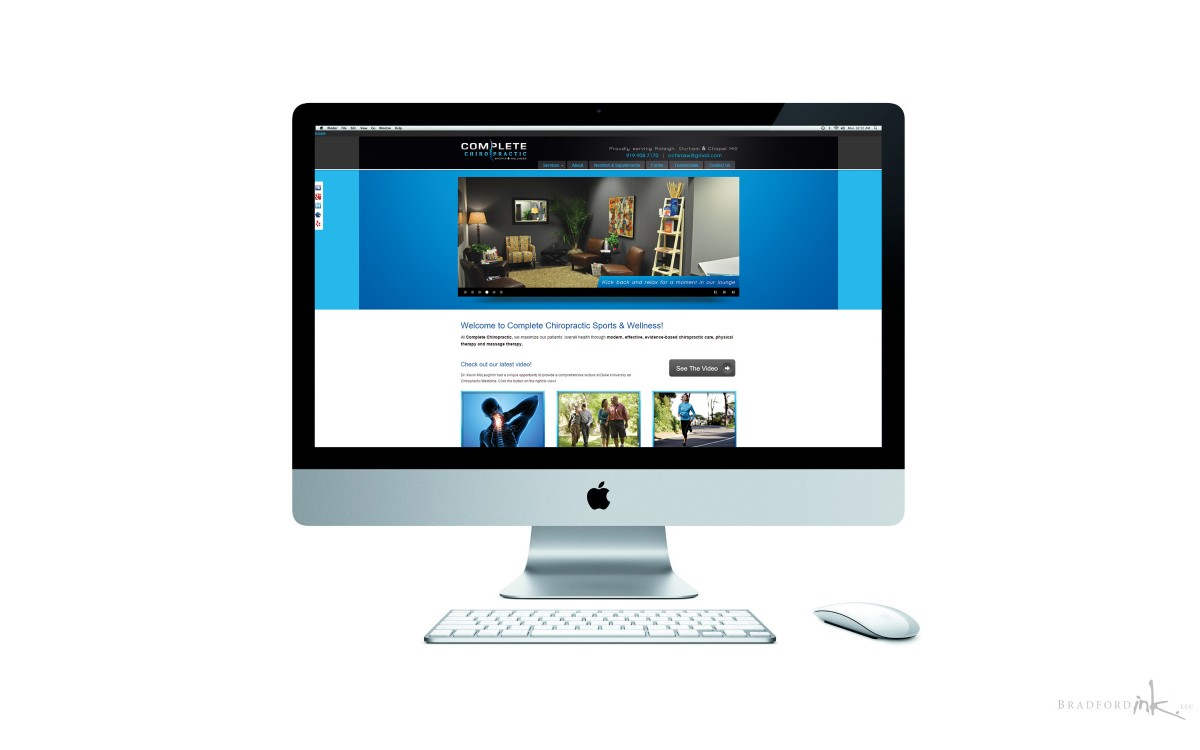
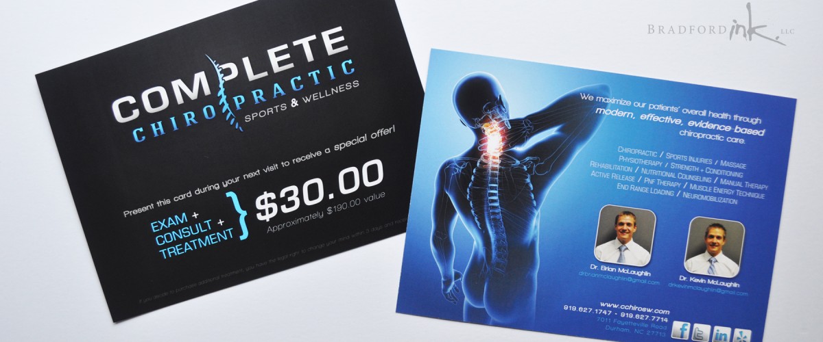
In addition to the logo design, Bradford Ink outfitted Complete Chiropractic with a suite of marketing material including cards, mailers, signage, and decor.  No business can survive without a well-rounded website, so Bradford Ink was also contracted to direct, and construct their comprehensive WordPress site.

LOGO FEATURES

Chiropractic work can mean a lot of things to a lot of people, but Dr.’s Brian and Kevin McLaughlin’s passion in the chiropractic world really centered around decreasing pain and increasing performance in athletes.  We needed something with a sense of movement and a little extra power behind design to speak to the nature of the clientele.  Additionally, it was important to find a spinal graphic that we could integrate into the logo that didn’t fall into the same look and feel as every other chiropractic logo that uses such a common feature.

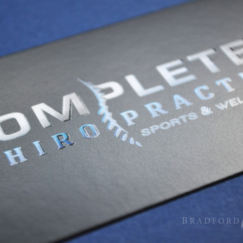
The result was a distinct logo that jumps out of its surroundings thanks to electric colors, well planted fonts that feel both powerful and current, and a spinal graphic that has an almost tactile fluidity to its form.  Complete Chiropractic utilizes both the full logo and spinal graphic in various capacities and has enjoyed the high visibility and heightened local recognition that the design has delivered for their business.

PRINT MARKETING DELIVERABLES

Bradford Ink worked with Complete Chiropractic from the very conception of the company, and all the way through the construction of their office.  Because of this close relationship, it was possible to figure out very early on exactly what printed materials would be most useful.  We ended up with a suite of marketing assets including:

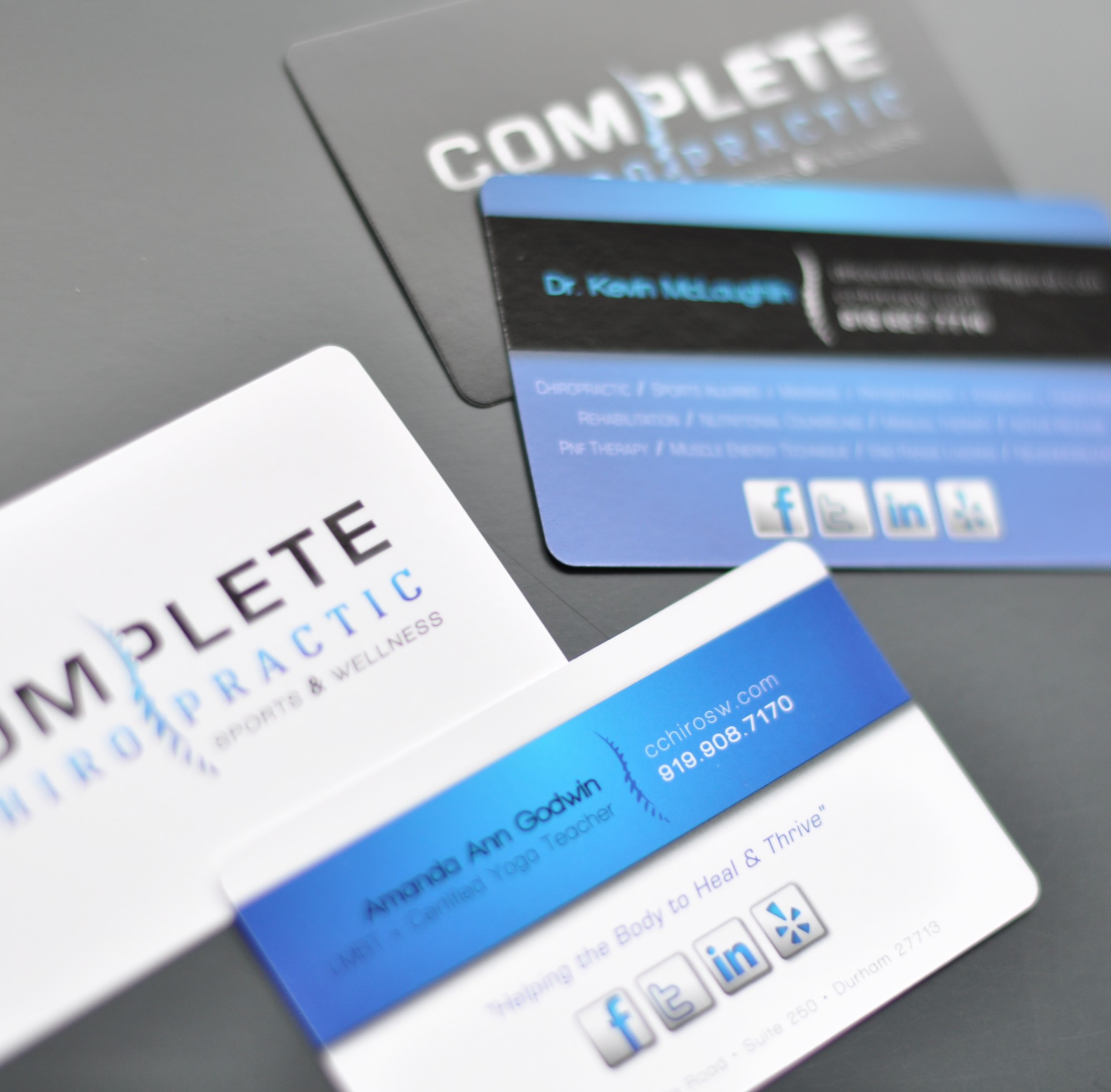
  • business cards
  • appointment reminder cards
  • mailers
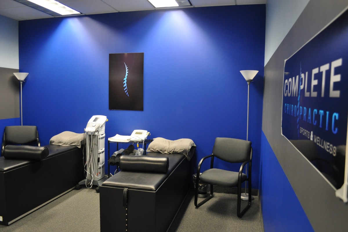
  • office decor
  • signage

Whether your’e holding one of the beautiful spot-gloss business cards, looking over a postcard that just came in the mail, or glancing up at the bright decor in the waiting room, every item Bradford Ink developed for Complete Chiropractic shares a similar DNA in the design elements.  The energetic colors, concise logo design and organization of critical info all help to bring the business to a level that local competition can’t put their hands on.

WEB DESIGN AND SUPPORT

It was crucial that the office had a intuitive, sustainable web presence to go with their new office opening.  Bradford Ink stepped in with a full WordPress multi-page site build after the original web designer abandoned the work shortly after establishing a basic web host.  Starting from a blank slate, we worked out a viable template design and from there Bradford Ink customized all aspects of the site to suit Complete Chiropractic’s branding and marketing needs.  Vibrant photography was combined with a coherent graphic package to create a site that really projects the essence of the business.  Alterations were made over time as the site was launched to ensure reliable and capable operation.

SIGNAGE

Graphics were created for a large, single color sign mounted to the brick facade on the front of the office, as well as a folding sidewalk sign board with the office’s logo and floor number.

PHOTOGRAPHY

Bradford Ink spent considerable time photographing Complete Chiropractic’s office construction as well as all furnishing and office spaces once the construction was completed.  These photos were deployed on the website as images for both specific pages and the main slideshow on the home page.

CLIENT

Complete Chiropractic Sports & Wellness

MISSION

ground-up Brand Identity, collateral, signage, and new website

HATS WORN

Designer, Web Designer, Photographer, and On-Site Consultant
Complete-Chiro-Card-Wide
CC-site-on-monitor
Complete-Chiro-Postcard-Wide
mug 118
DSC_0033
cc newold
front gloss